Over the past year we removed Angular’s legacy compiler and rendering pipeline which enabled the development of a series of developer experience improvements in the past couple of months. Angular v15 is the culmination of this with dozens of refinements which lead to better developer experience and performance.
Standalone APIs are now out of developer preview!
In v14 we introduced new standalone APIs which enable developers to build applications without using NgModules. We’re happy to share that these APIs graduated from developer preview and are now part of the stable API surface. From here on we will evolve them gradually following semantic versioning.
As part of making sure standalone APIs were ready to graduate we have ensured that standalone components work across Angular, and they now fully work in HttpClient, Angular Elements, router and more.
The standalone APIs allow you to bootstrap an application using a single component:
import {bootstrapApplication} from '@angular/platform-browser';
import {ImageGridComponent} from'./image-grid';

@Component({
  standalone: true,
  selector: 'photo-gallery',
  imports: [ImageGridComponent],
  template: `
    … <image-grid [images]="imageList"></image-grid>
  `,
})
export class PhotoGalleryComponent {
  // component logic
}

bootstrapApplication(PhotoGalleryComponent);
Router and HttpClient tree-shakable standalone APIs
You can build a multi-route application using the new router standalone APIs! To declare the root route you can use the following:
export const appRoutes: Routes = [{
  path: 'lazy',
  loadChildren: () => import('./lazy/lazy.routes')
    .then(routes => routes.lazyRoutes)
}];
Where lazyRoutes are declared in:
import {Routes} from '@angular/router';

import {LazyComponent} from './lazy.component';

export const lazyRoutes: Routes = [{path: '', component: LazyComponent}];
and finally, register the appRoutes in the bootstrapApplication call:
bootstrapApplication(AppComponent, {
  providers: [
    provideRouter(appRoutes)
  ]
});
Another benefit of the provideRouter API is that it’s tree-shakable! Bundlers can remove unused features of the router at build-time. In our testing with the new API, we found that removing these unused features from the bundle resulted in an 11% reduction in the size of the router code in the application bundle.
Directive composition API
The directive composition API brings code reuse to another level! This feature was inspired by the most popular feature request on GitHub asking for the functionality to add directives to a host element.
The directive composition API enables developers to enhance host elements with directives and equips Angular with a powerful code reuse strategy, that’s only possible thanks to our compiler. The directive composition API only works with standalone directives.
Let’s look at a quick example:
@Component({
  selector: 'mat-menu',
  hostDirectives: [HasColor, {
    directive: CdkMenu,
    inputs: ['cdkMenuDisabled: disabled'],
    outputs: ['cdkMenuClosed: closed']
  }]
})
class MatMenu {}
In the code snippet above we enhance MatMenu with two directives: HasColor and CdkMenu. MatMenu reuses all the inputs, outputs, and associated logic with HasColor and only the logic and the selected inputs from CdkMenu.
This technique may remind you of multiple inheritance or traits in some programming languages, with the difference that we have a mechanism for resolution of name conflicts and it’s applicable to user interface primitives.
Image directive is now stable!
We announced developer preview of the Angular image directive that we developed in collaboration with Chrome Aurora in v14.2.
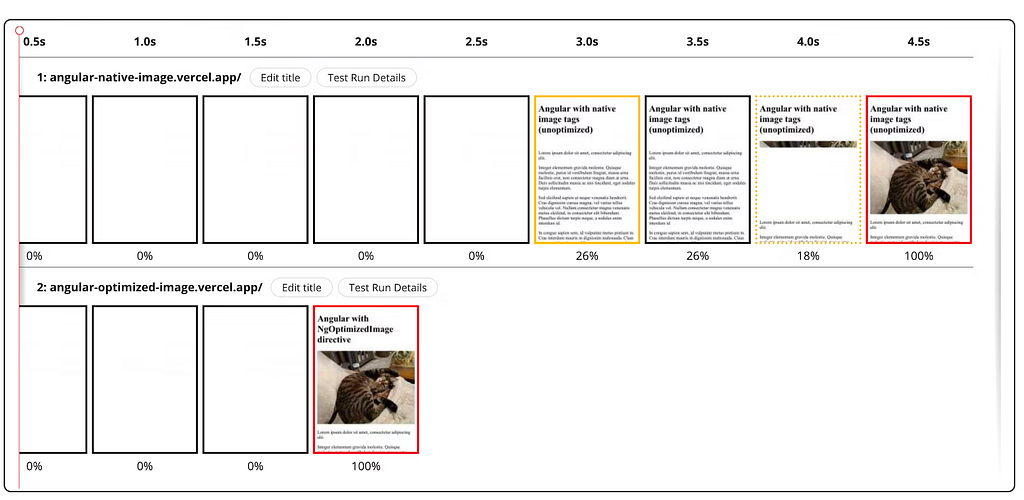
We’re excited to share that it is now stable! Land’s End experimented with this feature and observed 75% improvement in LCP in a lighthouse lab test.
The v15 release also includes a few new features for the image directive:
- Automatic srcset generation: the directive ensures that an appropriately sized image is requested by generating the srcset attribute for you. This can reduce download times for your images.
- Fill mode [experimental]: this mode causes the image to fill its parent container, removing the requirement to declare the image’s width and height. It’s a handy tool if you don’t know the sizes of your images or if you’d like to migrate CSS background images to use the directive.
You can use the standalone NgOptimizedImage directive directly in your component or NgModule:
import { NgOptimizedImage } from '@angular/common';

// Include it into the necessary NgModule
@NgModule({
  imports: [NgOptimizedImage],
})
class AppModule {}

// ... or a standalone Component
@Component({
  standalone: true
  imports: [NgOptimizedImage],
})
class MyStandaloneComponent {}
To use it within a component just replace the image’s src attribute with ngSrc and make sure you specify the priority attribute for your LCP images.
You can find more information in our documentation.
Functional router guards
Together with the tree-shakable standalone router APIs we worked on reducing boilerplate in guards. Let’s look at an example where we define a guard which verifies if the user is logged in:
@Injectable({ providedIn: 'root' })
export class MyGuardWithDependency implements CanActivate {
  constructor(private loginService: LoginService) {}

  canActivate() {
    return this.loginService.isLoggedIn();
  }
}

const route = {
  path: 'somePath',
  canActivate: [MyGuardWithDependency]
};
LoginService implements most of the logic and in the guard we only invoke isLoggedIn(). Even though the guard is pretty simple, we have lots of boilerplate code.
With the new functional router guards, you can refactor this code down to:
const route = {
  path: 'admin',
  canActivate: [() => inject(LoginService).isLoggedIn()]
};
We expressed the entire guard within the guard declaration. Functional guards are also composable — you can create factory-like functions that accept a configuration and return a guard or resolver function. You can find an example for running router guards serially on GitHub.
Router unwraps default imports
To make the router simpler and reduce boilerplate further, the router now auto-unwraps default exports when lazy loading.
Let’s suppose you have the following LazyComponent:
@Component({
  standalone: true,
  template: '...'
})
export default class LazyComponent { ... }
Before this change, to lazy load a standalone component you had to:
{
  path: 'lazy',
  loadComponent: () => import('./lazy-file').then(m => m.LazyComponent),
}
Now the router will look for a default export and if it finds it, use it automatically, which simplifies the route declaration to:
{
  path: 'lazy',
  loadComponent: () => import('./lazy-file'),
}
Better stack traces
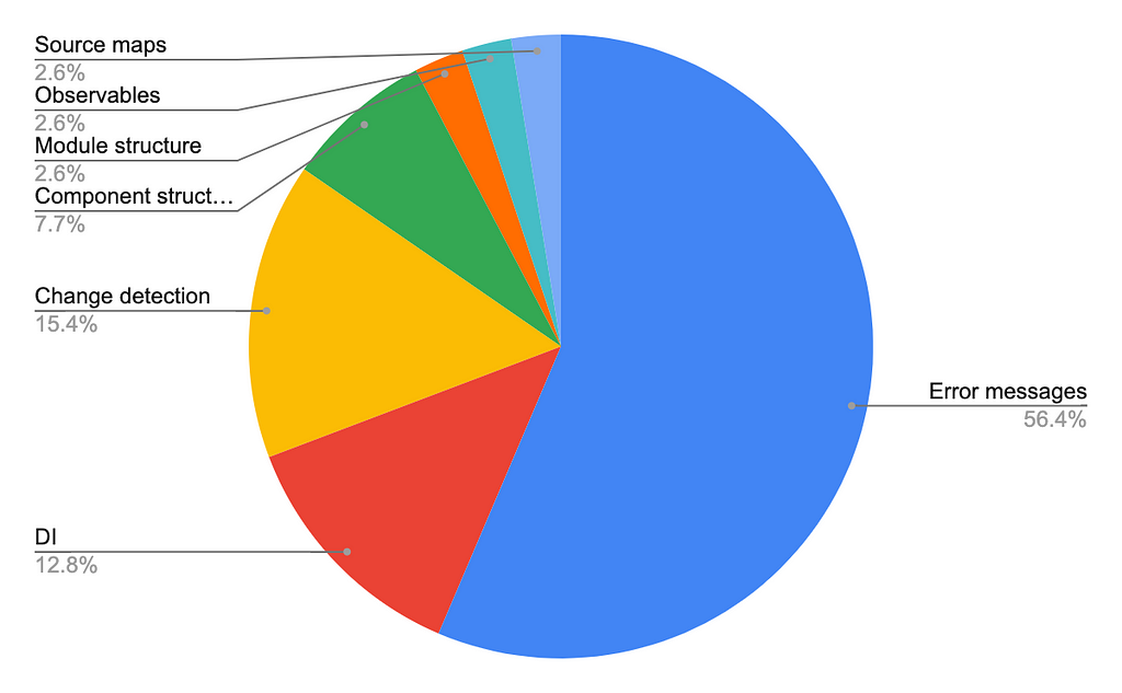
We get lots of insights from our annual developer surveys so we want to thank you for taking the time to share your thoughts! Digging deeper into the struggles with debugging experience developers face we found that error messages could use some improvement.
Debugging struggles for Angular developers
We partnered with Chrome DevTools to fix this! Let’s look at a sample stack trace that you may get working on an Angular app:
ERROR Error: Uncaught (in promise): Error
Error
    at app.component.ts:18:11
    at Generator.next (<anonymous>)
    at asyncGeneratorStep (asyncToGenerator.js:3:1)
    at _next (asyncToGenerator.js:25:1)
    at _ZoneDelegate.invoke (zone.js:372:26)
    at Object.onInvoke (core.mjs:26378:33)
    at _ZoneDelegate.invoke (zone.js:371:52)
    at Zone.run (zone.js:134:43)
    at zone.js:1275:36
    at _ZoneDelegate.invokeTask (zone.js:406:31)
    at resolvePromise (zone.js:1211:31)
    at zone.js:1118:17
    at zone.js:1134:33
This snippet suffers from two main problems:
- There’s only one line corresponding to code that the developer has authored. Everything else is coming from third-party dependencies (Angular framework, Zone.js, RxJS)
- There’s no information about what user interaction caused the error
The Chrome DevTools team created a mechanism to ignore scripts coming from node_modules by annotating source maps via the Angular CLI. We also collaborated on an async stack tagging API which allowed us to concatenate independent, scheduled async tasks into a single stack trace. Jia Li integrated Zone.js with the async stack tagging API, which allowed us to provide linked stack traces.
These two changes dramatically improve the stack traces developers see in Chrome DevTools:
ERROR Error: Uncaught (in promise): Error
Error
    at app.component.ts:18:11
    at fetch (async)
    at (anonymous) (app.component.ts:4)
    at request (app.component.ts:4)
    at (anonymous) (app.component.ts:17)
    at submit (app.component.ts:15)
    at AppComponent_click_3_listener (app.component.html:4)
Here you can follow the execution from the button press in the AppComponent all the way to the error. You can read more about the improvements here.
Release MDC-based components to stable
We’re happy to announce the refactoring of the Angular material components based on Material Design Components for Web (MDC) is now done! This change allows Angular to align even closer to the Material Design specification, reuse code from primitives developed by the Material Design team, and enable us to adopt Material 3 once we finalize the style tokens.
For many of the components we’ve updated the styles and the DOM structure and others we rewrote from scratch. We kept most of the TypeScript APIs and component/directive selectors for the new components identical to the old implementation.
We migrated thousands of Google projects which allowed us to make the external migration path smooth and document a comprehensive list of the changes in all the components.
Due to the new DOM and CSS, you will likely find that some styles in your application need to be adjusted, particularly if your CSS is overriding styles on internal elements on any of the migrated components.
The old implementation of each new component is now deprecated, but still available from a “legacy” import. For example, you can import the old mat-button implementation by importing the legacy button module.
import {MatLegacyButtonModule} from '@angular/material/legacy-button';
Visit the migration guide for more information.
We moved many of the components to use design tokens and CSS variables under the hood, which will provide a smooth path for applications to adopt Material 3 component styles.
More improvements in components
We resolved the 4th most upvoted issue — range selection support in the slider.
To get a range input use:
<mat-slider>
  <input matSliderStartThumb>
  <input matSliderEndThumb>
</mat-slider>
Additionally, all components now have an API to customize density which resolved another popular GitHub issue.
You can now specify the default density across all of your components by customizing your theme:
@use '@angular/material' as mat;

$theme: mat.define-light-theme((
  color: (
    primary: mat.define-palette(mat.$red-palette),
    accent: mat.define-palette(mat.$blue-palette),
  ),
  typography: mat.define-typography-config(),
  density: -2,
));

@include mat.all-component-themes($theme);
The new versions of the components include a wide range of accessibility improvements, including better contrast ratios, increased touch target sizes, and refined ARIA semantics.
CDK Listbox
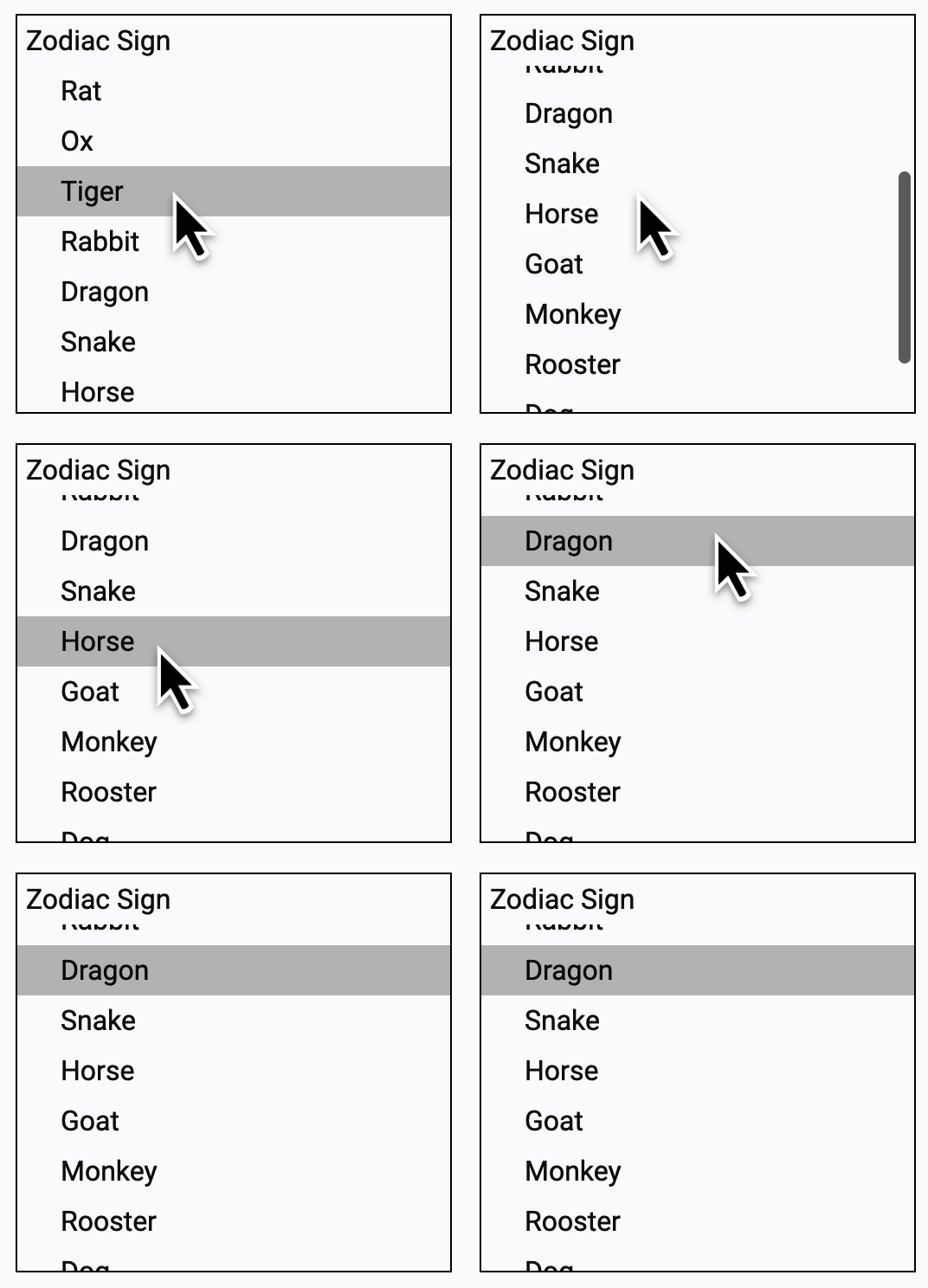
The Component Dev Kit (CDK) offers a set of behavior primitives for building UI components. In v15 we introduced another primitive that you can customize for your use case — the CDK listbox:
The @angular/cdk/listbox module provides directives to help create custom listbox interactions based on the WAI ARIA listbox pattern.
By using @angular/cdk/listbox you get all the expected behaviors for an accessible experience, including bidi layout support, keyboard interaction, and focus management. All directives apply their associated ARIA roles to their host element.
Improvements in the experimental esbuild support
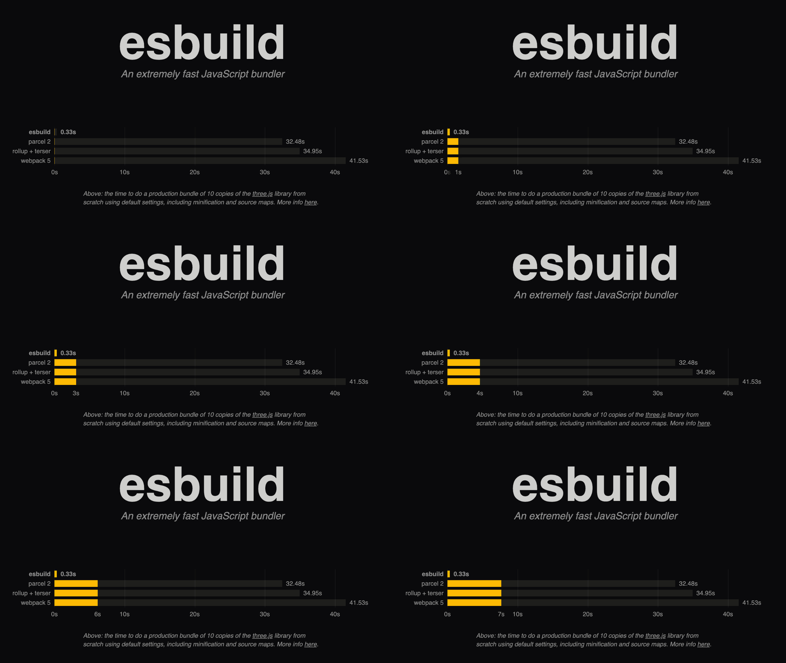
In v14 we announced the experimental support for esbuild in ng build to enable faster build times and simplify our pipeline.
In v15 we now have experimental Sass, SVG template, file replacement , and ng build –watchsupport! Please give esbuild a try by updating your builders angular.json from:
"builder": "@angular-devkit/build-angular:browser"
to:
"builder": "@angular-devkit/build-angular:browser-esbuild"
If you encounter any issues with your production builds, let us know by filing an issue on GitHub.
Automatic imports in language service
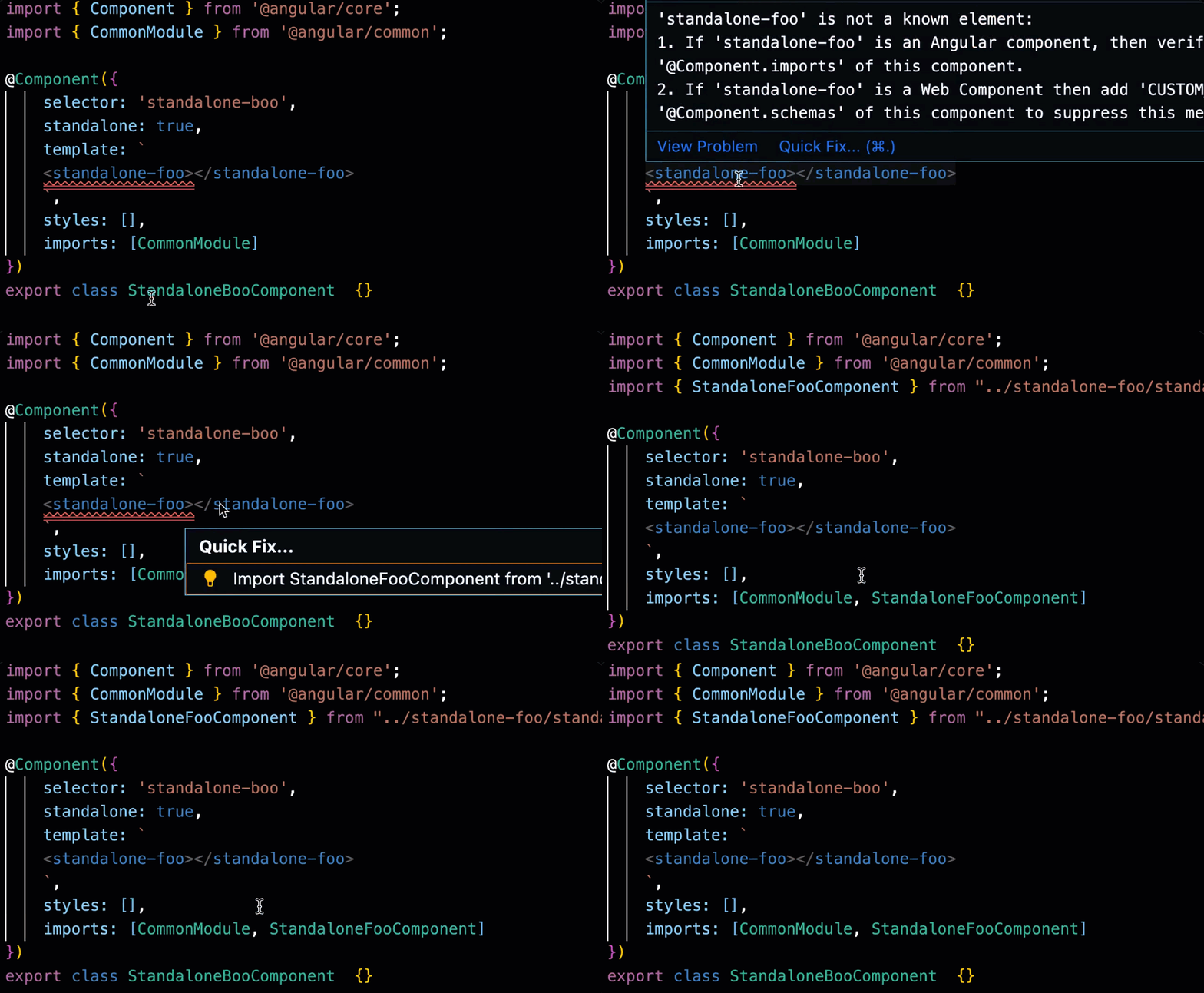
The language service now can automatically import components that you’re using in a template but haven’t added to a standalone component or an NgModule.
CLI improvements
In the Angular CLI we introduced support for standalone stable APIs. Now you can generate a new standalone component via ng g component –standalone.
We’re also on a mission to simplify the output of ng new. As a first step we reduce the configuration by removing test.ts, polyfills.ts, and environments. You can now specify your polyfills directly in angular.json in the polyfills section:
"polyfills": [
  "zone.js"
]
To reduce configuration overhead further, we now use .browserlist to allow you define the target ECMAScript version.
Community contribution highlights
We’re grateful to share that since the release of v14 we received contributions from over 210 people across framework, components, and CLI! In this section, I’d like to highlight two of them.
Provide an ability to configure default options for DatePipe
This feature by Matthias Weiß allows you to globally change the default formatting configuration for DatePipe. Here’s an example with the new bootstrapApplication API:
bootstrapApplication(AppComponent, {
  providers: [
    {
      provide: DATE_PIPE_DEFAULT_OPTIONS,
      useValue: { dateFormat: 'shortDate' }
    }
  ]
});
The configuration above will enable shortDate format for all the places you use DatePipe in your application.
Add <link> preload tag for priority images during SSR
To make sure priority images are loaded as quickly as possible, Jay Bell added a functionality to the image directive to include a <link rel=”preload”> tag for them when using Angular Universal.
There’s no action needed on your end if you’ve already enabled the image directive. If you’ve specified an image as priority, the directive will automatically preload it.
Deprecations
Major releases allow us to evolve the framework towards simplicity, better developer experience, and alignment with the web platform.
After analyzing thousands of projects within Google we found few rarely used patterns which in most cases are misused. As result we’re deprecating providedIn: ‘any’ is an option which has very limited use apart from a handful of esoteric cases internal to the framework.
We’re also deprecating providedIn: NgModule. It does not have wide usage, and in most cases is used incorrectly, in circumstances where you should prefer providedIn: ‘root’. If you should truly scope providers to a specific NgModule, use NgModule.providers instead.
With the evolving layout in CSS, the team will stop publishing new releases of @angular/flex-layout. We’ll continue providing security and browser compatibility fixes for the next year. You can learn more about this in the first blog post from our “Modern CSS” series.
Excited about what’s coming up next!
The launch of Ivy in 2020 enabled a lot of improvements across the board that you can find already rolling out. Optional NgModules is a great example. It helps with reduction of the concepts beginners need to deal with as part of their critical learning journey and also supports advanced features such as directive composition API via standalone directives.
Next we’re tackling improvements in our server-side rendering pipeline and reactivity while bringing quality of life improvements across the board!
Can’t wait to share with you what’s coming up next!
Angular v15 is now available! was originally published in Angular Blog on Medium, where people are continuing the conversation by highlighting and responding to this story.


