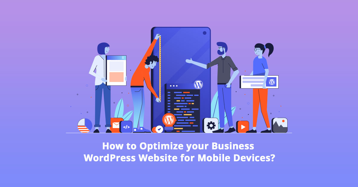
When it comes to the devices used for interacting with digital platforms, it is an undeniable fact that mobile devices are taking over desktops. Browsing, local searches, online shopping, emails, etc., are mostly done from mobile devices, making it necessary for businesses to have a mobile-friendly WordPress website.
Although statistics say that more than 50% of the traffic comes from mobile devices, many businesses are yet to have a responsive WordPress web design. Having a responsive WordPress web design is not easy either, certainly not doable by anyone without WordPress skills.
But a WordPress development company in India can provide you with comprehensive WordPress development services crucial for a successful marketing strategy. In simple terms, a successful marketing strategy includes having a fast, user-friendly site and a design that is compatible with smaller screens.
Here’s a look at some methods to optimize your WordPress website to have a responsive WordPress web design.
- Choose a responsive WordPress theme for a mobile-friendly WordPress website: A mobile-optimized or responsive WordPress theme eliminates the necessity of investing in two different sites – one for custom mobile and another for the traditional desktop site. No matter what device your customers or users are using for accessing your website, a responsive WordPress theme will adjust itself automatically according to the screen size. Using a responsive WordPress theme is one of the important aspects of a responsive WordPress web design, as it makes the website load faster and perform well on mobile devices, tablets, and desktops. Most modern WordPress themes are responsive designs, but you can also buy paid themes for building a mobile-friendly WordPress website. However, if you already have a custom theme that you don’t want to change, you can hire WordPress development services to convert it into a responsive theme. Don’t forget to keep updating your themes as soon as your developer updates them; otherwise, it can be the culprit of a major slowdown of your WordPress website.
- You Can Use a Plugin for Mobile-optimized Content: If you are looking for ways to avoid implementing a responsive WordPress theme, maybe you would be up for using a WordPress plug from the WordPress plugin repository. Just like WordPress has a plugin for everything, you can have one for creating a mobile-friendly WordPress website version of your site as well. However, this simple method comes with few limitations in WordPress website development. You should know beforehand that plugins will not be as customizable as a responsive theme. And using a plugin for building a mobile-friendly WordPress website is not a future-proof solution, as, with the new WordPress updates, a plugin is likely to stop working. You can hire WordPress development services to keep all your themes and plugins updated, but that will only work if their developers update those plugins.
- Use Optimized Images: Modern web users don’t want to wait for your site to load for what it seems like forever. Either your site loads within 5 seconds (3 seconds sometimes) or your users bounce. It is easier to abandon your site soon because various other sites are ready to provide what the users are looking for. You will realize that, often, it is the size of the images that affect the speed of loading. But apart from the size, it can also be the overwhelming number of images that will slow down your WordPress website. This makes it necessary to replace all your large-sized images with compressed versions of the same and get rid of unnecessary images while working on WordPress website development. You can use online tools for compressing the images and make your website significantly faster. Or you can hire WordPress development services from a WordPress development company in India to optimize all the images on your site.
- Don’t Use Full-screen Popups: Many times websites have pop-ups regarding call to action, but if that pop-up is a full-screen one, the mobile users will be annoyed. Call to action are smart ways to get users to take an action you require them to, and for this reason, you cannot completely avoid them. But a WordPress development company in India can help you with WordPress website development, where they will add some CSS or JavaScript code to make the pop-up screen responsive. WordPress development services can also help you with various coding so that your website will recognize the browser type and will not show a pop-up if it is accessed from mobile. But having a responsive WordPress web design doesn’t mean your mobile site lacks something from a desktop site, and with a mobile-friendly WordPress plugin, you can add a similar popup for the call to action.
- Make the WordPress Website SEO Optimized: Apart from a WordPress development company in India, Google also provides you with some help to build a mobile-friendly WordPress website. If you are regularly working on boosting your mobile SEO, you can use a Google service called Google Search Console. You can use this service to fetch your site and find issues regarding your website. You might find many problems – broken links or poor redirects that might not affect your website’s desktop version but only relevant regarding your mobile version. You can look for SEO errors using plugins like Yoast SEO. Apart from these, you also need to note what plugins you are using for your website. Some plugins, like popup plugins, cover all of the mobile screens, in which case you might want to deactivate the pop-ups. Some other elements that require attention while working on a responsive WordPress web design are font size/style and buttons/tap targets that need to be responsive on smaller screens.
- Use Google AMP plugin for free on WordPress: Amongst many factors of Google’s search engine, page speed is very common. Whether it is mobile or desktop, Google favors a website that gives the users a good performance. While working on a mobile-friendly WordPress website, you can use Google Accelerated Mobile Pages (AMP), which will help you with a faster website while accessed from mobile. WordPress has recently added support for Google’s Accelerated Mobile Pages (AMP) to their site. Anyone can use it for their WordPress website development in building a mobile-friendly WordPress website. Installing this plugin on your WordPress website is easy, and all you have to know is to use the right plugins. However, it may take you more than just one step. Hence you can request help from a WordPress development company in India for an error-free setup.
- Make Sure You Have Suitable Web Hosting: While WordPress development companies in India work hard to make your site a responsive web design, it might still fall behind if you are not using a reliable web hosting service. Hosting plans like shared hosting for your business website might cause you a great deal of trouble when it experiences a traffic spike. It is also possible that your website will be taken offline if your server is unable to handle the amount of traffic. Hosting services like dedicated or cloud hosting can provide you with high speed and excellent website performance.
Takeaway
While choosing dedicated or cloud hosting is not always a cheap option, affordable hosting solutions from NTSPL might make you consider. NTSPL is an IT consulting and Enterprise Solution based in India, catering to global requirements since 2007.
As a WordPress development company in India, NTSPL also provides WordPress website development and WordPress development services. The WordPress development services include services that make your website mobile-friendly – WordPress Theme Customization, WordPress Plugin Development, WordPress Maintenance Service, etc.


